
15 BEST Landing Page Dos & Don’ts For Conversions
Looking for the best way to optimize your landing page? We’ve compiled a list of our top 15 dos and don’ts to get the highest conversions.

You’ve spent hours dissecting analytics and designing a killer landing page—but are you getting the conversions you deserve? Are there any minor tweaks that can be made to optimize your results even more? If so, we have just what you need: an easy-to-digest guide to the 15 landing page dos & don’ts for boosting conversions.
What is a landing page?
Here’s the “textbook” answer: A landing page is a mid-funnel web page designed with the goal of driving a visitor to take action. It’s usually used for making sales, generating leads, and it typically features strong imagery and persuasive copywriting.
But here’s the “real” answer: A landing page is where users come when their curiosity is at its peak, and the final CTA is a mere click away. It’s where all your hard work building the sales funnel layers that came before finally pay off (or not!)
According to WordStream, you’ve got about a 2.35% chance to convert a lead on a landing page in any given industry. The upper end of the spectrum (the top 25th percentile) is hitting a conversion rate as high as 5-plus percent—not bad odds!
Most common types of landing pages
Splash Page
- What it is: The first page users see when they land on your website.
- When to use it: For introducing your brand, collecting emails, and announcing sales.
Squeeze Page
- What it is: A lead generation landing page designed to get user information. For example, brands may ask users to sign up for a webinar or download an ebook in exchange for their email.
- When to use it: For building email lists ahead of a new campaign or product launch.
Sales Page
- What it is: A service or product landing page designed to close the deal.
- When to use it: For getting users to start a free trial, subscribe to a platform, or purchase a product.
Here’s what to include on a landing page:
No matter what kind of landing page you’ve created, here are 15 landing page dos & don’ts you should follow to ensure it’s optimized for the best chance at a conversion.
1. DO prioritize clean, fast landing page design and UX.
Nothing says, “quick, abort mission!” quite like an off-putting landing page. The internet is a scary place with lots of cybercriminals itching to steal personal information, and whether they know it or not, users are subconsciously looking for cues that signal whether your site seems legitimate or sketchy.
Trustworthy landing pages are visually neat, with breathable space between segments and a simple design that loads quickly and flows intuitively, so users feel at ease. That means brands should ditch things like loud background colors, hard-to-read typography, and slow-loading crazy graphics.
2. DO optimize for mobile.
Considering 63% of all queries now occur on cell phones, your business could miss out on serious conversions if you aren’t optimizing for mobile traffic.
Nearly every landing page should be designed with mobile users in mind—which means making sure things like margins, images, and buttons are appropriately formatted for cellular devices. Users aren’t going to stick around if your landing page looks like a jumbled mess on their phone.
3. DO use concise, skimmable headlines and simple copy.
If you think people intend to read your page word for word from top to bottom, you’d only be right 20% of the time. Time and time again, researchers show that most internet users skip the fine print, meaning you need neatly chunked, easily digestible, logically organized headlines and text.
Additionally, your landing page copy needs to be so strong customers feel compelled to click that CTA button without another thought. That means using persuasive language, highlighting key benefits over features, and opting for shorter sentences.
4. DO create distinct landing pages for each audience segment.
If you’re trying to appeal to multiple demographics with one landing page, chances are your conversions won’t be as high as they could be. That’s because different people respond to different words, visuals, and written styles—all of which need to be taken into account when creating landing pages.
The key here is personalization: create landing pages tailored specifically for each segment, and make sure the landing page copy speaks directly to them. Remember: if you try to appeal to everyone, you won’t appeal to anyone.
5. DO include a single, simple, powerful call to action.
Avoid demanding more than one action from your landing page visitors. The goal of a landing page is to get someone to click, sign up, or purchase something—so include one prominent CTA that stands out and contains words like “try,” “buy,” or “free trial” to grab their attention.
6. DO explain what users should expect when they complete the CTA.
People are more likely to click on your landing page CTA if they know what’s in it for them. So be sure to use copy that clearly explains what users should expect when they complete the action—whether it’s checking their email right away for a free ebook or expecting a phone call from a sales rep within 24 hours.
7. DO use data and A/B testing to optimize conversions.
It’s nearly impossible to create the perfect landing page without data. Instead of relying on guesswork, test different landing page variations and track which ones get the most conversions. With A/B testing, you can determine which elements need improvement and how else you can better optimize your landing pages for maximum conversion potential.
8. DO include testimonials and helpful user-generated content.
User-generated content (UGC) is a powerful landing page element, as it encourages potential customers to trust your product or service. Additionally, including testimonials from satisfied past customers can help boost conversions, as browsers are more likely to take the plunge if they know others have already taken that leap and had success with it.
9. DO include a video of you, your product, or your service in action.
People love video content—especially if it’s helpful. So if your landing page includes a demo of you, your product, or your service in action, this can help people visualize how it would be to use and encourage them to take the next step. Plus, videos keep people engaged longer on landing pages and increase conversions.
10. DO invest the majority of your spend on mind-blowing creative.
Investing in high-quality creative content allows brands to create unique and memorable experiences for their target audience, increasing the likelihood of recall, recognition, and ultimately, conversion.
Whether it’s a visually stunning video, clever and witty copy, or an eye-catching graphic design, investing in high-quality creative can help brands grab consumers’ attention and stand out from their competitors.
Finally, DO remember that content is king, assuming it meets all the necessary creative benchmarks required to do its job.
What NOT to include on a landing page:
If you’re getting lackluster results, it’s likely because one of these big landing page bloopers is causing your marketing efforts to go astray.
11. DON’T ask your lead to put forth much effort.
Asking leads to fill out lengthy forms with too many questions or make a large commitment won’t get you very far. Instead, stick to short forms and only ask for information that is absolutely necessary so the conversion is lightning-fast and seamless.
12. DON’T distract users with unnecessary links.
Keep your landing page focused on a single action or message. Don’t include links to additional pages, additional CTA buttons, navigation bars, or other distractions that could cause users to wander off the landing page and away from your main goal.
13. DON’T bury important info below the fold.
There’s a saying in journalism: “don’t bury the lede.” This also applies to marketers—make sure the most crucial information that you want landing page visitors to pay attention to is prominently displayed above the line so they don’t have to scroll.
14. DON’T plant your only CTA at the bottom of the page.
Don’t make landing page visitors search for your CTA. Instead, place multiple opportunities for users to convert throughout the landing page—including at least one close to the top—to ensure that landing page visitors can easily find it and complete the action.
15. DON’T get hung up on SEO for short-term campaigns (but DO for long-term campaigns).
Optimizing your page for SEO won’t be necessary if you’re running a landing page for a short-term, one-time-only PPC campaign. Instead, focus your energy on making sure the landing page content is compelling and informative without worrying too much about the technicalities of SEO.
But if you’re creating landing pages that will last more than a few months, SEO should be taken into consideration.
Best landing page examples and why they work
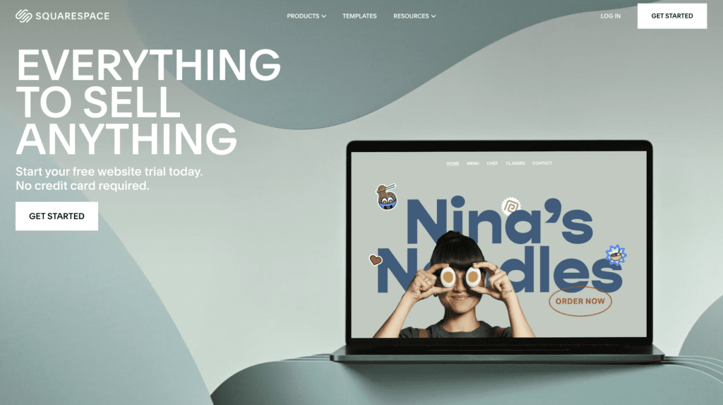
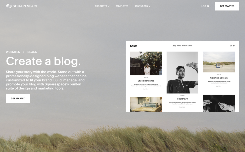
Squarespace
Squarespace has clearly done its homework when it comes to its target audiences. In these examples, one page targets business owners, while the other targets bloggers. Users instantly know they’ve arrived in the right place based on their unique identity.
In addition, each page features simple and beautiful designs, an easy-to-follow headline clearly stating the product’s main benefit, and clear CTA buttons that feel inviting and low risk.
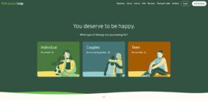
Better Help
BetterHelp is an online therapy platform with a clean and easy-to-navigate landing page, making it simple for users to find the right therapy for them. The landing page design is minimal yet visually compelling, providing users with a clear path to getting the help they need.
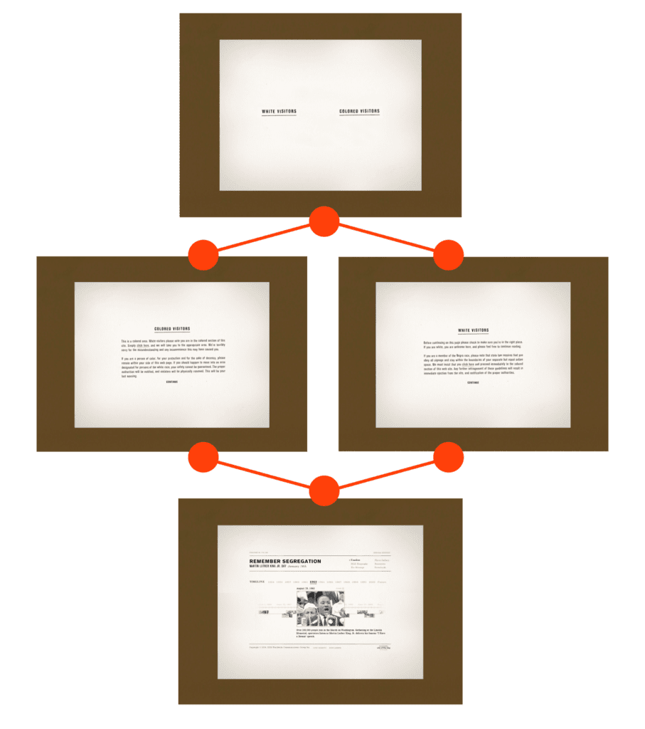
Civil Rights History
Hey Advertising created a powerful and thought-provoking web experience that won a Webby award by intentionally shocking visitors with a “segregated” landing page. The purpose of this approach was to demonstrate the sting of segregation and the impact it had on the lives of Black Americans during the Civil Rights era.
By creating a jarring, segregated landing page, Hey Advertising aimed to spark conversation, educate, and encourage visitors to take action against injustice. Their bold approach was highly effective in communicating the core message—segregation hurts.
Holland America (HAL)
Hey Advertising also created an exceptional landing page experience that truly stood out in the crowded cruise industry. By recognizing the importance of engaging potential customers before they make a purchase, Hey developed a landing page that effectively showcased Holland America Line’s focus on gastronomic excellence through its Culinary Council content platform.
The custom landing page featured visually stunning and interactive videos and profiles of celebrity chefs like Marcus Samuelsson and Jacques Torres. Shot on location at various restaurants in New York, Amsterdam, and Chicago, the documentary profiles and recipe videos effectively brought the Culinary Council program to life.
By effectively engaging potential customers with HAL’s unique focus on food and drink, Hey successfully captured their attention and enticed them to book a cruise with HAL.

What are the biggest landing page mistakes?
- Not including a clear call-to-action (CTA). Your landing page should have an obvious CTA button to help steer users in the right direction and encourage them to take action.
- Not using analytics to track landing page performance. Make sure you have analytics tracking set up so you can measure the effectiveness of your landing pages over time. This will help you identify any problems and highlight what works and what doesn’t so that you can make adjustments accordingly.
- Not testing landing page variations. Testing landing page variations is vital to landing page optimization. Try different headlines, images, colors, and CTA buttons to see what works best for your audience.
Should I use paid search to drive traffic to my landing page?
New content can take months, sometimes years, to outperform existing content in your niche. Plus, knowing which search terms you need to target is a challenge—especially if you’re not a technical paid search expert who knows how to track key analytics.
So if you’re considering using paid search to get a bump in traffic, here’s what you need to know to decide between organic vs paid search.
Get creative and technical landing page expertise.
Landing pages are a critical part of any digital marketing strategy, so invest in creating one that works for your brand. The marketing experts at Hey specialize in landing page optimization and can help you create a landing page that’s designed to generate leads and conversions.
Our creative designers, copywriters, and website developers are here to help—reach out today to find out how we can help you optimize your ROI with expertly crafted landing pages.
 Eric Gutierrez
 Eric Gutierrez
Partner, Chief Creative Officer

Comments are closed.